Colour contrast
Colour contrast is a vital part of accessibility. Colours on social media graphics, emails, presentations and documents should be fully accessibility. The Web Content Accessibility Guidelines (WCAG) outlines the standards for colour contrast.
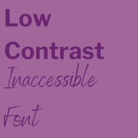
In summary, colours need to have a minimum contrast ratio of 1.4.3 in order to be accessible. You can easily check if content meets this standards with online contrast checkers such as WebAIM or ContrastChecker.com.

Font
Sans-serif fonts are accessible, serif fonts are not. Sans-serif translates to without serif.
Fonts in italic or script are not accessible. Stick to simple fonts such as arial, calibri or Helvetica.
Serif (E.g Times New Roman, Cambria)

Sans Serif (e.g Calibri, Arial, Helvetica)