

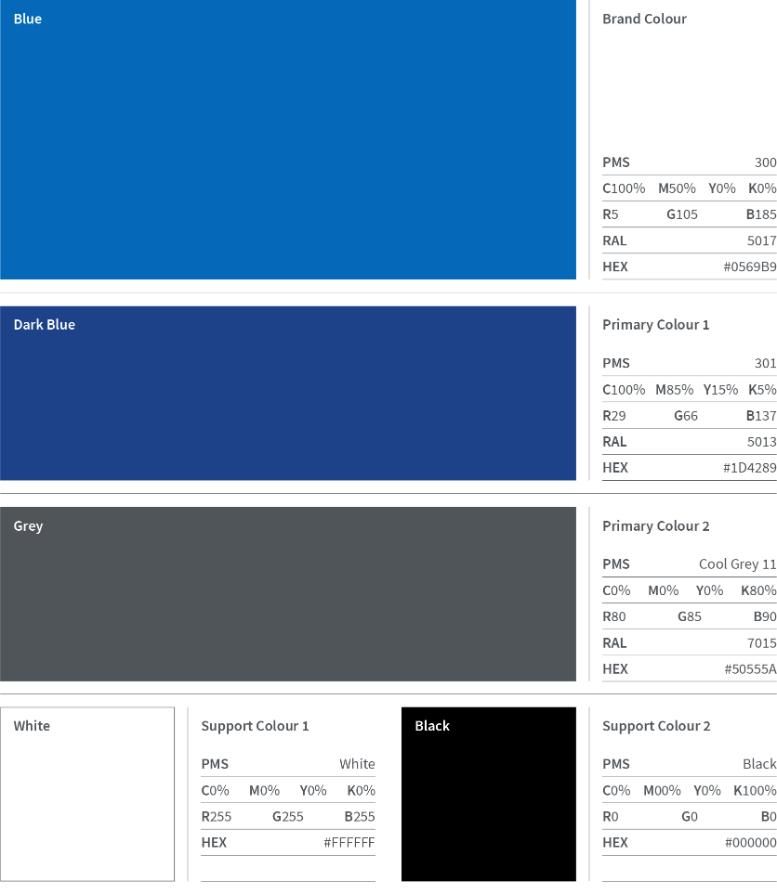
Colour is a key part of the Trinity visual identity and should be used consistently across all communications. Blue is the defining brand colour, followed by our primary dark blue and grey, with white and black supporting. These colours should lead on all applications to create a clear, recognisable, and consistent brand presence across print, digital, and environmental communications.
Tints
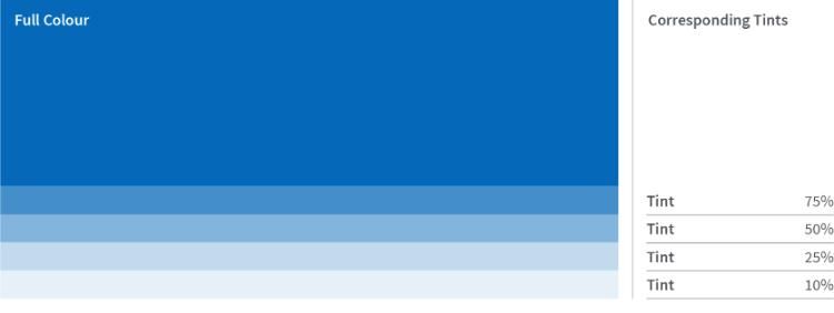
Tints may be used to introduce tonal variation into layouts. They work best when paired with their corresponding full colour, or as light background tones that create visual hierarchy. Tints should not be used for text, buttons, or interactive elements where WCAG AA contrast compliance is required — always use the full colour values in those contexts.
Accessibility
Colour must always support clarity and legibility for all users. WCAG AA compliance is a minimum standard that applies across all communications, not only where accessibility is specifically flagged.
For normal text, a minimum contrast ratio of 4.5:1 must be maintained against the background. For large text (18pt or above, or 14pt bold and above), a minimum of 3:1 applies. The same 3:1 ratio is required for non-text elements such as buttons, icons, and interface borders.
Stronger contrast is always encouraged. The approved colour combinations shown here meet these requirements and should be used as the default starting point for all design decisions.
Secondary Colour Palette
There is also a secondary palette available which supports the primary palette above. The secondary palette should complement the primary palette and should not dominate primary brand expression.
There Trinity Marketing manages the implementation and development of the university's visual identity. Please contact Trinity.Marketing@tcd.ie should you have any queries.