Initially, we assume a closed economy and examine the following instruments
Subsequently, we relax the closed economy assumption and examine the effect of interventions in a small open economy. The case of agricultural market interventions in a large open economy is considered further in Lecture 17.
Interventions are of two kinds
- transfer schemes (designed to change income distribution, but with allocation effects, e.g. farm supports)
- incentive schemes (designed to change people's behaviour but with income distribution effects e.g. road pricing,
carbon tax). Such schemes originate in an attempt by government to correct for market failures because of externalities or the existence of public goods.
In agricultural policy, Pillar 1 interventions under the CAP are examples of transfer schemes while Pillar 2 interventions are examples of incentive schemes.
- for transfer schemes, the benefits may appear at first to be equal to the size of the transfer. However, the policy analyst
must be aware that the actual incidence of a tax or subsidy is not the same as its formal incidence. By changing
their behaviour, agents can shift their liability or eligibility. We need to model the behaviour of agents (and thus understand the allocation effects of the transfer) in order
to assess the benefits of transfer schemes.
- for incentive schemes, measuring the benefits is even more complex because, in most cases, the benefits cannot be directly priced and hence indirect ways of valuing these benefits must be found. We examine some of the methods which can be used to value environmental benefits of agricultural environmental schemes in Lecture 27.
- modelling the impact of policy interventions can be complex where there are linkages between markets and more
than one market may be affected - partial equilibrium analysis, multi-market analysis, general equilibrium analysis.
- most obviously, budget costs or consumer costs (in case of market price interventions)
- less obviously, overall cost to society. How much poorer is society overall?
- Can be concerned with broad transfers between groups (e.g., between farmers and consumers), or with the distribution of benefits or
costs within groups (e.g., between small and large farmers).
- There may be an issue of weighting benefits and costs accruing to different groups, cf. political preference
function literature.
- in the case of incentive schemes, we are interested in the benefit/cost ratio (weighted where appropriate)
- in the case of transfer schemes, we are interested in the transfer efficiency - would it be possible to make
the transfer at less cost using some alternative mechanism?
The role of the policy analyst can be summarised using the policy analysis diamond.
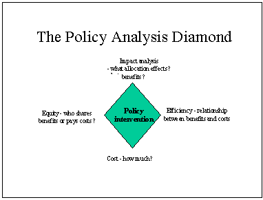
Policy analysis consists of tracing through the consequences of government interventions in a market, or series
of linked markets, to determine (a) the price and quantity changes induced by the policy intervention, and (b)
the welfare effects of these changes.
Interventions are often represented by shifts in supply or demand curves
Examples: consumer subsidy, producer subsidy, input subsidy, quotas.
The resulting welfare changes are measured as the changes in producer surplus , consumer surplus , and taxpayer revenues.
Interventions can take the form of a fixed or proportional tax or subsidy:
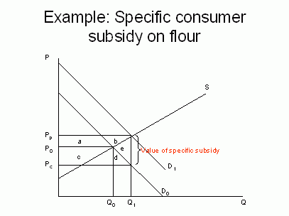
The figure above shows the market for a food commodity, let us say flour. At the original equilibrium, given by the intersection of the supply curve SS and the demand curve D, the market price is P0 and the quantity supplied and demanded is Q0. Suppose now that the government introduces a specific consumer subsidy. The effect of this is to shift the demand curve upwards (the new demand curve is sometimes called the subsidy-laden demand curve). The subsidy drives a wedge between the price received the producer - the producer price Pp - and the price paid by the consumer - the consumer price Pc - measured by the vertical distance Pp - Pc.
In order to restore market equilibrium following the introduction of the subsidy, the market price (including the subsidy) rises to Pp and the quantity supplied rises to Q1. Given this market price, the price the consumer actually pays is the market price less the subsidy, which is Pc. The fact that the market price rises means that some of the benefit of the subsidy, intended presumably to benefit consumers, leaks out to benefit producers. We can evaluate the benefits to consumers and producers by looking at the changes in consumer and producer surplus.
The increase in producer surplus is given by the area a+b. The increase in consumer surplus is given by the area c+d. These benefits to producers and consumers are paid for by taxpayers. The welfare loss to the taxpayer is the value of expenditure on the consumer subsidy, which is given by the entire rectangular area a+b+c+d+e, i.e. the volume of the product consumed at the new equilibrium, multiplied by the value of the unit subsidy, or the price wedge, given by the difference between Pp and Pc.
Note that the gains to producers and consumers do not entirely match the cost to the taxpayer. The difference, the area e, represents the economic cost or the deadweight cost to society, or the loss of real income, involved in making these transfers.
| Change in consumer surplus | c+d |
| Change in producer surplus | a+b |
| Change in taxpayer expenditure | -(a+b+c+d+e) |
| Total welfare change | -e |
The relative benefits to producers and consumers of a consumer subsidy depend on the relative slopes of the supply and demand curves. The more inelastic supply is relative to demand, the more the consumer subsidy will actually benefit producers. In the extreme case of perfectly inelastic supply, the entire expenditure on the consumer subsidy would benefit producers. Conversely, the more inelastic demand is relative to supply, the more the consumer subsidy will benefit consumers. In the extreme case of perfectly inelastic demand, and only in this case, will the entire expenditure on the consumer subsidy actually benefit consumers. You should examine the effect of altering supply and demand elasticities in the spreadsheet model of the wheat market to familiarise yourself with these relationships.
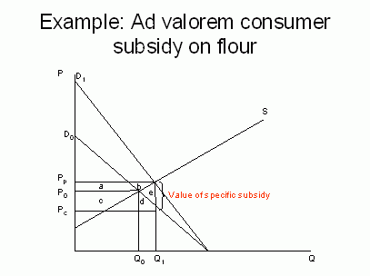
If the consumer subsidy is a proportional or ad valorem one (i.e., expressed as a percentage of the price of flour), then the subsidy-laden demand curve rotates rather than shifts. But the allocation effects and welfare analysis are the same.
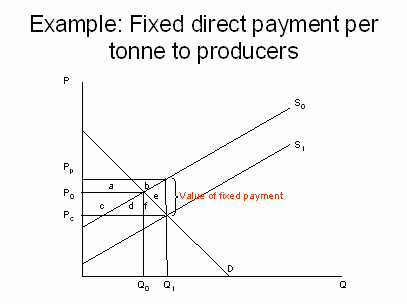
Suppose government introduces a fixed payment per tonne of wheat produced in order to improve the income of wheat producers. This can be represented as a downward shift in the producers' supply curve as, taking the subsidy into account, producers are now willing to produce the same amount at a lower market price than before. However, the greater willingness of producers to supply wheat drives down the market price (in a closed economy) so some of the benefit of the subsidy leaks away to consumers. We can quantify the welfare effects as follows.
Although the market price falls to Pc, the effective price to producer including the fixed payment is Pp. Producers benefit by the increase in their producer surplus of a+b. Consumers also benefit because of the increase in their consumer surplus by c+d+f. The cost of the subsidy is borne by taxpayers, who are worse off by the value of the subsidy payment, which is given by the rectangular area a+b+c+d+e+f (i.e., the product of the total production and the amount of the payment). Overall, there is a welfare cost to society of the area e arising from this transfer policy.
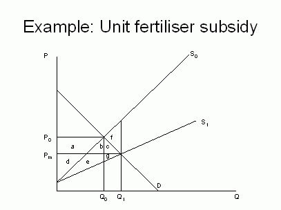
The figure above again shows the market for wheat. Suppose that wheat is produced using a fixed input, land, and a variable input, fertiliser. The initial market equilibrium is P0 and Q0. Suppose that the government introduces a unit fertiliser subsidy. Although this is a fixed amount, greater amounts of fertiliser are used to produce higher-cost wheat, so the effect of the subsidy is to rotate the supply curve downwards to SS'. The assumption is made that the value of input subsidy per unit of output increases linearly with output. The subsidy results in a fall in the market price from P0 to Pm, and an increase in the quantity of wheat traded from Q0 to Q1.
The welfare effects are as follows. Consumers are clearly better off as a result of the fall in price by the area a+b+c. The effect on producers is ambiguous. Prior to the introduction of a subsidy, producer surplus amounted to a+d. After the subsidy, the producer price has fallen, but so have farmers' costs of production. Their new producer surplus (read from the subsidy-laden supply curve S1) is d+ e+g. Thus the change in producer surplus is the new producer surplus d+e+g minus the old producer surplus a+d, which equals e+g-a. Whether area e+g is bigger than area a depends on the elasticity of demand (taking the supply curves as given). We can note that if the demand curve is inelastic over the relevant range, the more likely it is that area a is greater than area e+g, and that producers experience a net loss. This is despite the fact that the introduction of a fertiliser subsidy presumably was supposed to benefit them!
To calculate the total welfare change, we must take into account the cost of the fertiliser subsidy to the taxpayer. In the case of the consumer subsidy above, we calculated this as the total volume of quantity demanded times the size of the unit subsidy, which was given by the price wedge. This was because the consumer subsidy was paid directly for the consumption of the product. In this diagram, however, the subsidy is an input subsidy paid on the use of fertiliser, not a production subsidy paid to wheat producers. We can estimate the value of the fertiliser subsidy (and, thus, the cost of the subsidy to the taxpayer) as the reduction in the cost of wheat production to farmers. This is shown as the area between the two supply curves up to the (new) quantity of wheat produced, i.e. f+b+c+e+g. Thus our welfare calculation looks as follows.
| Change in consumer surplus | a+b+c |
| Change in producer surplus | e+g-a |
| Change in taxpayer expenditure | -(f+b+c+e+g) |
| Total welfare change | -f |
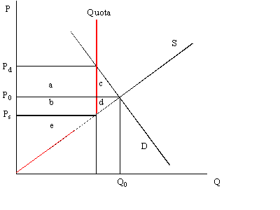
In discussing the farm problem, we identified the more rapid growth in supply relative to demand as one factor putting downward pressure on farm prices and thus farm incomes. Thus it is not surprising that farmers have sometimes sought to protect themselves against the supply treadmill by seeking production controls. The dairy quota regime in the EU is an example. One way to represent a production quota is as a vertical supply curve at the point where the quota becomes binding. Thus the overall supply curve is kinked at the level of the production quota. Producer response to price changes is asymmetric. To the left of the quota, if the price falls, then so will supply. However, to the right of the quota, if the price increases, the producer is prevented from increasing supply and the supply curve becomes totally inelastic.
The welfare effects of a production quota can be identified as follows:
| Change in consumer surplus | -(a+c) |
| Change in producer surplus | +(a+b+e)-(b+d+e) |
| Change in taxpayer expenditure | 0 |
| Change in overall welfare | -c-d |
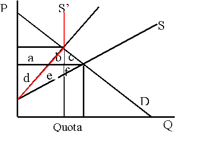
These economic costs can be minimised by allowing trade in quotas. The more efficient suppliers will find it possible to buy quota rights from the least efficient producers (because the rent generated by the quota will be greater if used by the more efficient producer). With a free market in quota rights, we would expect the most inefficient producers to be 'bought out' and to leave the industry, thus replicating the supply situation of the kinked supply curve. The policy lesson here is that, to minimise economic costs, the authorities should allow quota rights to be traded.
However, in practice, there are often restrictions on the trade in quota rights imposed for social and regional reasons. For example, in Ireland, milk quota is 'ring fenced' and cannot be traded or moved outside of particular coop areas in order to prevent the loss of quota from disadvantaged to more advantaged rural areas.
Ellis, F., 1992. Agricultural Policies in Developing Countries. Cambridge, Cambridge University Press, Chapter 3, 'Policy Analysis: Economics'.
Colman, D. and Young, T., 1989. Principles of Agricultural Economics, Cambridge, Cambridge University Press. Chapter 12, 'Food and agricultural policy'.
Good references to price policy analysis, though more detailed than required for our purposes, are:
Timmer, C.P., 1986. Getting Prices Right: The Scope and Limits of Agricultural Price Policy. New York, Cornell University Press.
Tsakok, I., 1990. Agricultural Price Policy: A Practitioner's Guide to Partial Equilibrium Analysis. New York, Cornell University Press.